Responsive web design · Desktop to mobile
Responsive design that feelsintentional at every size
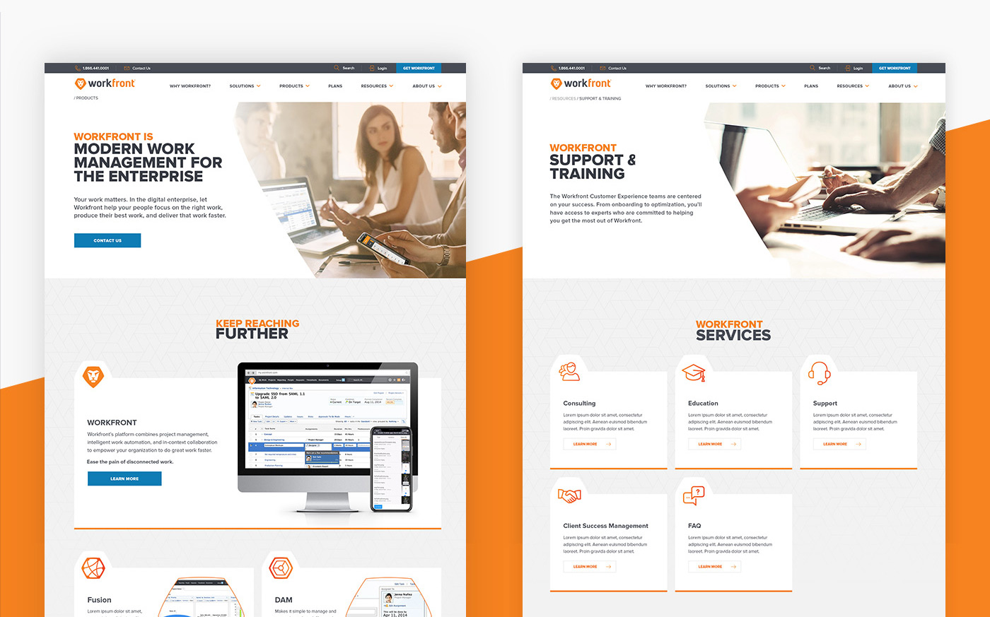
I design responsive websites as connected systems rather than scaled-down desktop layouts. Content priority, navigation, type, imagery and interaction are resolved for the screens people actually use.

Who it is for
- Teams whose mobile experience feels compressed
- Global sites with variable content and translations
- Products needing reliable breakpoint behavior
What I deliver
- Responsive content and navigation strategy
- Flexible grids and type scales
- Desktop, tablet and mobile key screens
- Component states and edge cases
- Accessible interaction specifications
- Implementation review and design QA
How I work
Responsive decisions begin during structure and wireframing, not after desktop approval.
Components are tested with short and long content, realistic imagery and changing viewport constraints before handoff.
Common questions
Do you design every screen size?
I define representative breakpoints and clear component behavior so development can interpolate confidently.
Can you fix only the mobile experience?
Yes. A focused audit can identify priority issues before redesigning key templates and components.