Investment Firm · UX/UI · Design System
DoubleLine
Reimagining the digital presence of one of the world's leading investment firms.
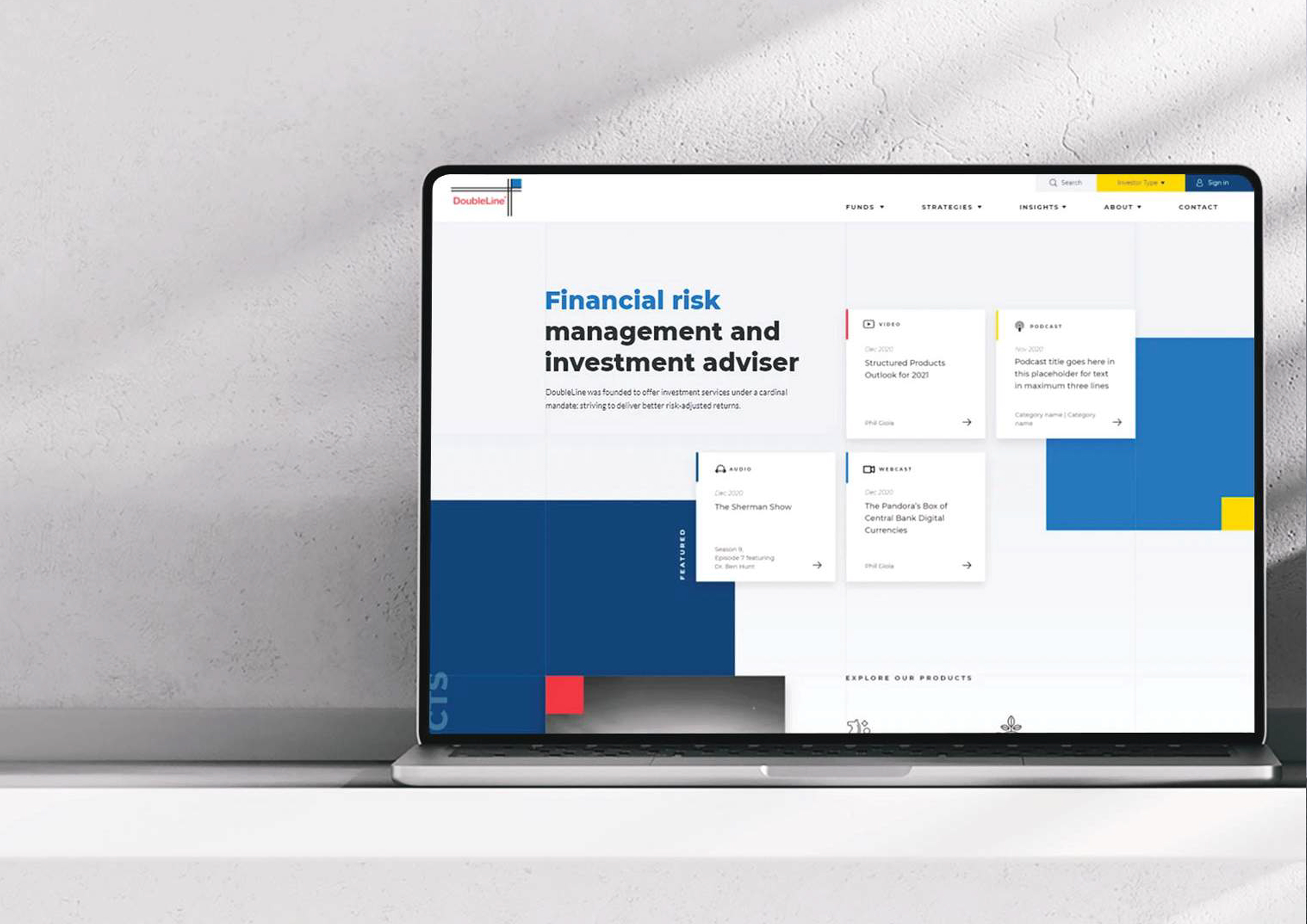
DoubleLine is recognized globally for its investment expertise, managing billions across fixed income and investment solutions. I reimagined its digital presence to better reflect the confidence, precision and sophistication that define the firm.

Overview
A respected investment firm whose digital experience no longer matched its reputation.
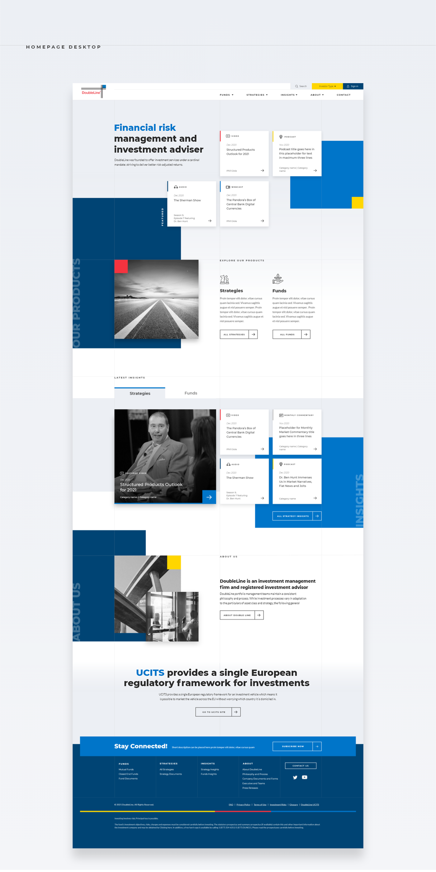
Despite its global standing, DoubleLine's digital experience no longer reflected the confidence and precision that define the organization. Years of incremental updates had created an increasingly fragmented ecosystem — inconsistent navigation, editorial content competing for attention, and product pages that had evolved independently over time.
The work wasn't simply refreshing the interface. It was creating a digital foundation capable of supporting the next chapter of the brand.
The Challenge
The challenge wasn't reducing complexity — it was organizing it.
Financial services operate in one of the most information-dense digital environments. Every page has to balance credibility, regulatory requirements, performance, accessibility and clarity — without overwhelming the user.
The experience needed to communicate authority while remaining approachable to both institutional investors and individual clients. Every interaction had to reinforce trust, letting users focus on insights rather than navigation.


Design Direction
Rather than inventing a new aesthetic, we looked inward.
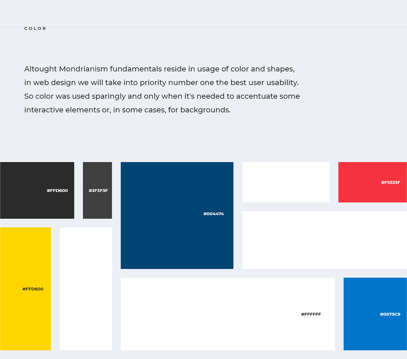
The strongest inspiration already existed within the DoubleLine identity. The geometric language embedded in the logo became the foundation for a broader system inspired by the balanced compositions of Piet Mondrian — not replicating an artistic style, but embracing the same principles of proportion, rhythm, hierarchy and intentional composition.
These ideas informed everything from page grids and spacing to typography, image placement and component behaviour — a system unmistakably connected to the brand without ever becoming decorative.
distinct concepts explored for validation
responsive, content-focused redesign
scalable system rooted in the brand's geometry
Design System
Enterprise websites rarely remain static.
New products launch, research libraries grow, campaigns evolve and content expands. Every interface was designed as part of a larger system rather than an isolated page — reusable components, flexible layouts, responsive behaviours and consistent spacing so future teams could keep building without sacrificing visual consistency.
The goal wasn't simply a redesigned website. It was a framework that could scale alongside the business.
“Successful design isn't measured by how different something looks after launch. It's measured by how naturally people are able to use it.”Miguel Mendonça — on designing DoubleLine
Impact
A modern digital foundation that reflects DoubleLine's standing.
Information became easier to navigate and interfaces more consistent, while the visual language evolved into a cohesive system capable of supporting future expansion and strengthening trust across every touchpoint — proof that thoughtful interface design can simplify highly complex information without compromising the authority expected of a global financial institution.

What I delivered
- 01 Homepage design
- 02 Interior page redesign
- 03 Mobile experience
- 04 Design system & geometry language
- 05 Interaction & scalability guidelines