Website Ecosystem · UI · Design System
Workfront
Designing a scalable digital ecosystem for an enterprise SaaS platform.
A scalable digital ecosystem for an enterprise SaaS platform — a flexible framework designed to grow without losing its identity across hundreds of pages.

Overview
Without a strong design system, every new page slowly drifts away from the one before it.
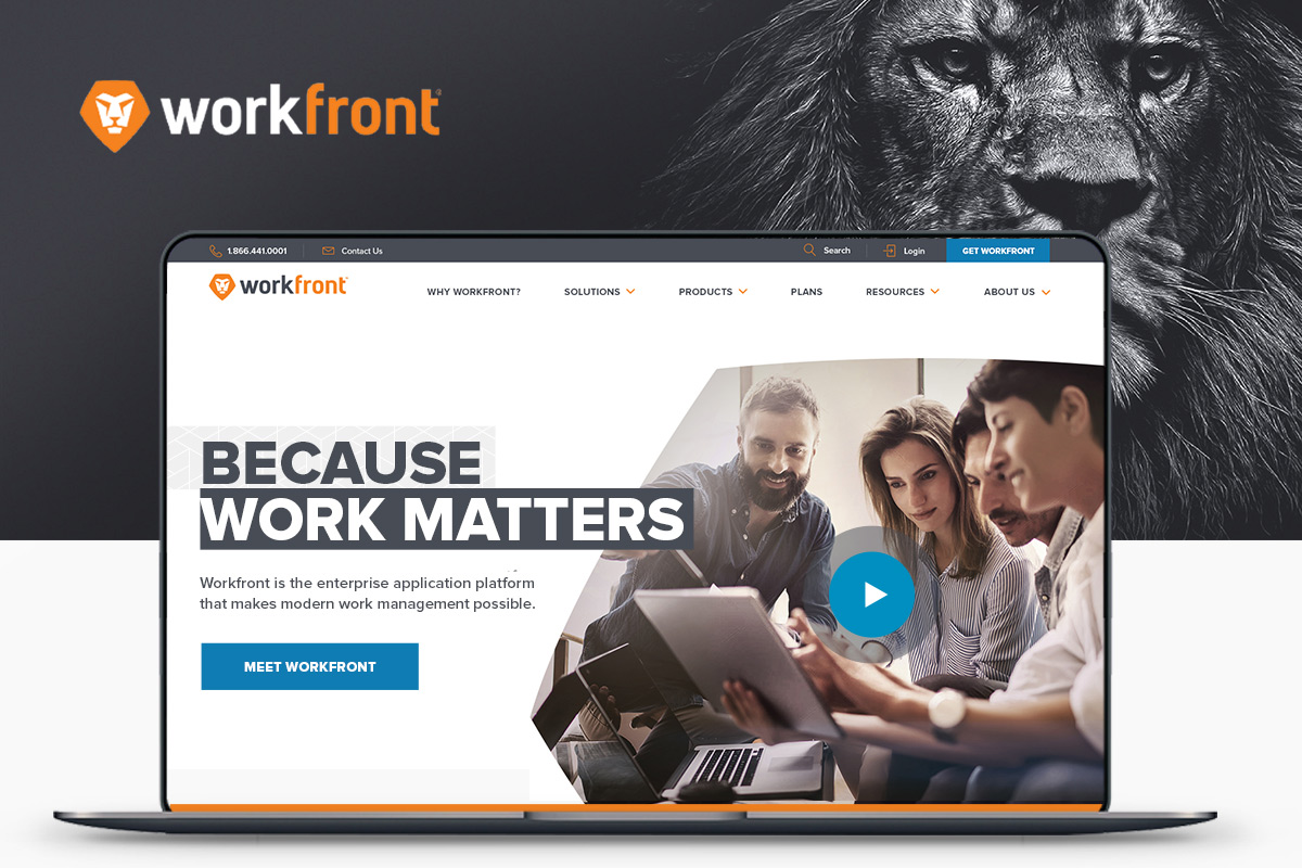
As digital products evolve, websites rarely stand still — new products launch, features expand, campaigns come and go, documentation grows. Workfront was already a leading enterprise work-management platform, and its website needed to support a rapidly evolving product while staying coherent across hundreds of marketing pages, educational resources, customer stories and product experiences.
The challenge wasn't designing a beautiful homepage. It was creating a digital ecosystem capable of growing without losing its identity.
The Challenge
Growth creates complexity — an architectural problem, not just a visual one.
Every new feature introduces another landing page, every campaign another template, every acquisition another product. Over time, websites become collections of disconnected experiences built by different teams at different moments.
Workfront needed a system capable of preventing that fragmentation — communicating innovation while remaining approachable, supporting increasingly diverse content, and flexible enough for future expansion without constant redesign.

Designing for Scale
One principle guided the entire project: design the system, not the page.
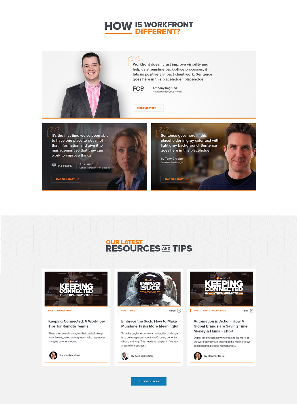
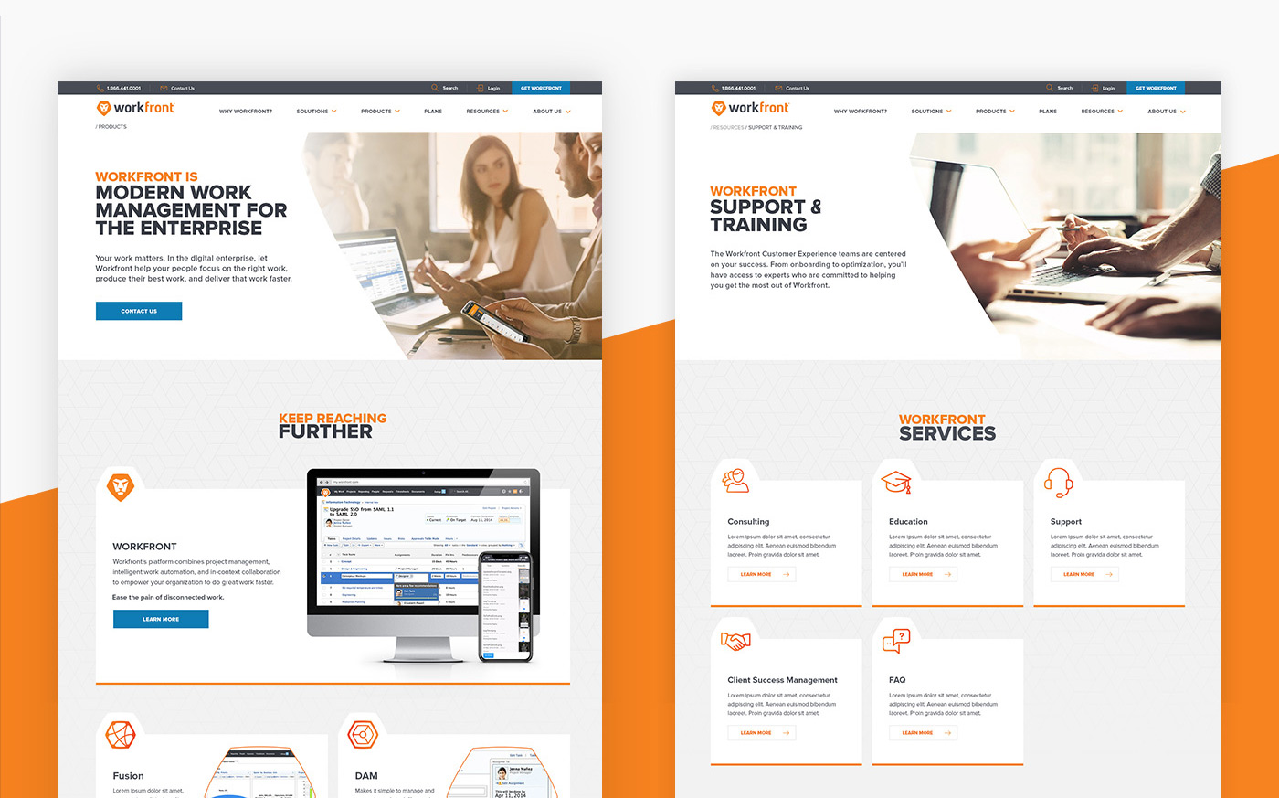
Instead of fixed layouts, we developed flexible building blocks that could be assembled in different ways while staying consistent. Reusable content modules, responsive grids, consistent spacing, adaptable typography and structured component libraries formed the foundation.
Whether introducing a new product, publishing a customer story or launching a campaign, every page could feel different while still belonging to the same ecosystem.
block-based system for the whole site
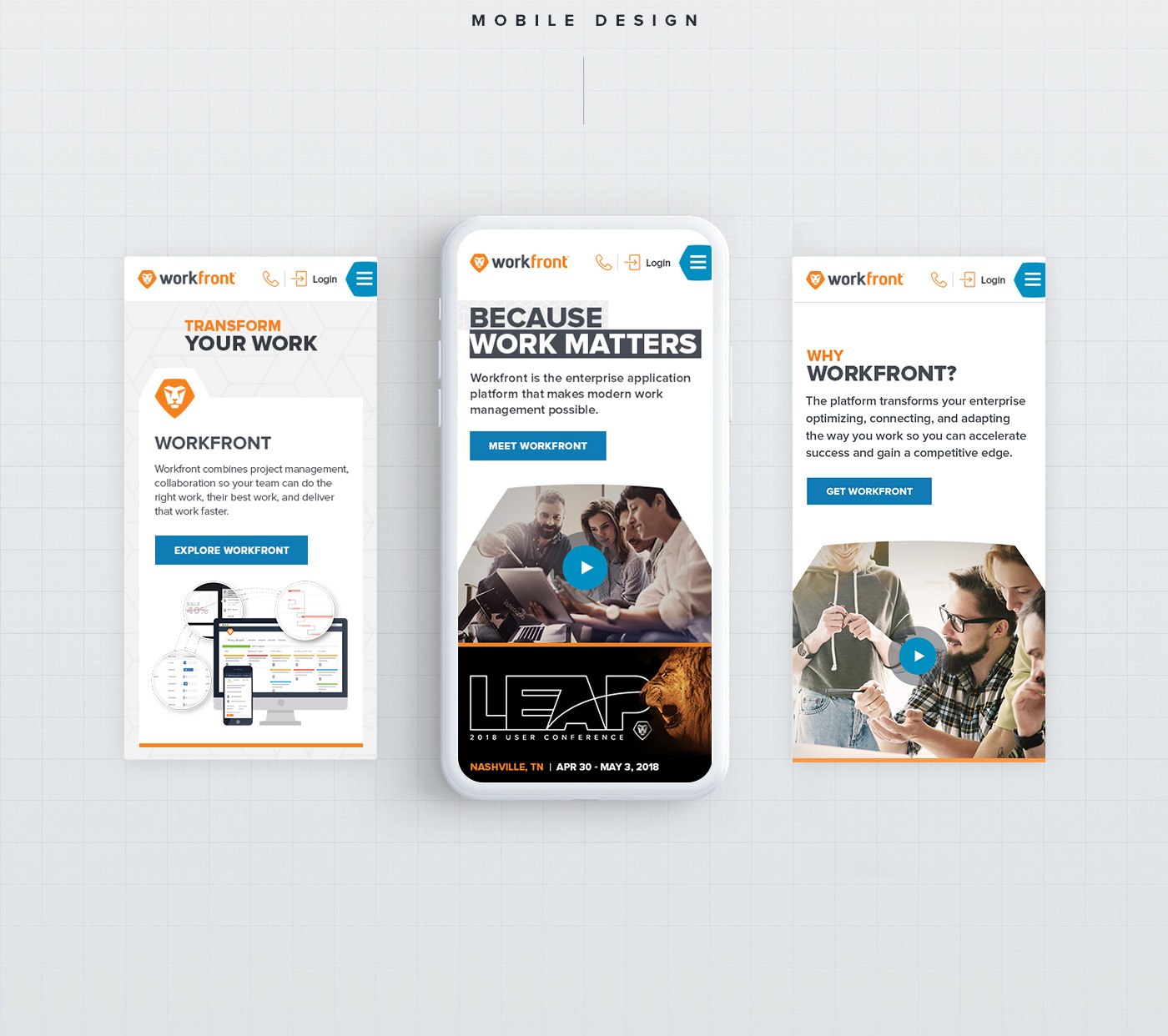
responsive across breakpoints
page layouts from one component kit
A Visual Language That Evolves
The strongest design systems rarely draw attention to themselves — they create confidence through consistency.
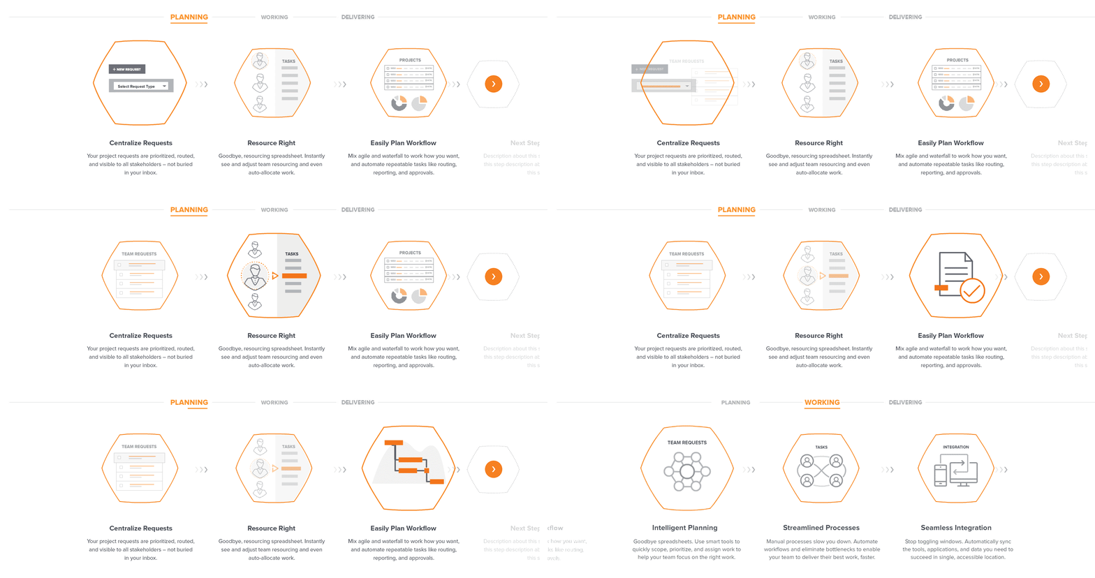
Typography, imagery, iconography and colour were treated as interconnected parts of a single visual language. Photography introduced warmth and humanity into an enterprise environment often dominated by abstract diagrams, generous whitespace improved readability across content-heavy pages, and clear hierarchy let users move naturally between education, product information and conversion.
The interface became quieter. The message became stronger.

Designing for Multiple Audiences
One framework, many different objectives.
Some visitors were discovering Workfront for the first time; others were existing customers looking for documentation, wanting product demonstrations, or evaluating enterprise software for their organization. Rather than isolated experiences for each audience, the design established a flexible framework capable of adapting to different needs while preserving one consistent experience throughout.
“The better the system, the more freedom teams have to focus on real problems instead of reinventing the same patterns over and over.”Miguel Mendonça — on designing Workfront
The Outcome
A scalable foundation the whole organization can build on.
The website became more consistent, easier to navigate and far more flexible for future growth. Rather than relying on isolated page designs, the organization gained a modular design ecosystem that improved collaboration between design, development and marketing — proof that thoughtful systems thinking can create consistency without sacrificing creativity.
What I delivered
- 01 Modular content-block library
- 02 Homepage & interior page design
- 03 Product page templates
- 04 Responsive layouts
- 05 Typography & imagery system