Corporate Website · UX/UI · Art Direction
Avetta
Simplifying complexity for a global enterprise supply-chain and contractor risk platform.
A corporate website redesign for one of the world's largest supply-chain and contractor risk ecosystems — transforming an enormous amount of technical information into an experience that feels structured, approachable and genuinely useful.
Overview
The best enterprise platforms feel powerful because users always know where they are.
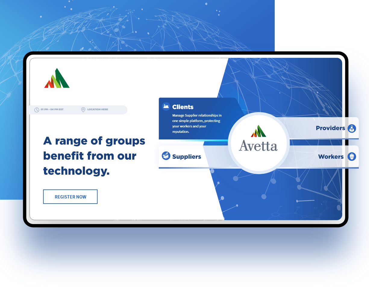
Avetta connects organizations, suppliers and contractors across one of the world's largest supply-chain and contractor risk-management ecosystems, supporting millions of business relationships. The platform is incredibly sophisticated — yet the website needed to feel approachable to completely different audiences, from enterprise executives and procurement leaders to contractors.
The objective wasn't simply to redesign a corporate website. It was to transform an enormous amount of technical information into an experience that felt structured, approachable and genuinely useful.
The Challenge
In enterprise software, the challenge rarely comes from aesthetics — it comes from complexity.
The site had to communicate a product ecosystem spanning contractor management, compliance, insurance verification, supplier qualification, sustainability, analytics and risk intelligence — without overwhelming users in their first few minutes.
Different audiences arrived with different goals. A procurement executive wanted confidence. A contractor wanted clarity. A prospect wanted proof. Existing clients wanted resources. The experience had to support every one of them while staying visually consistent across hundreds of pages.
Designing for Clarity
One principle influenced every decision: reduce cognitive load.
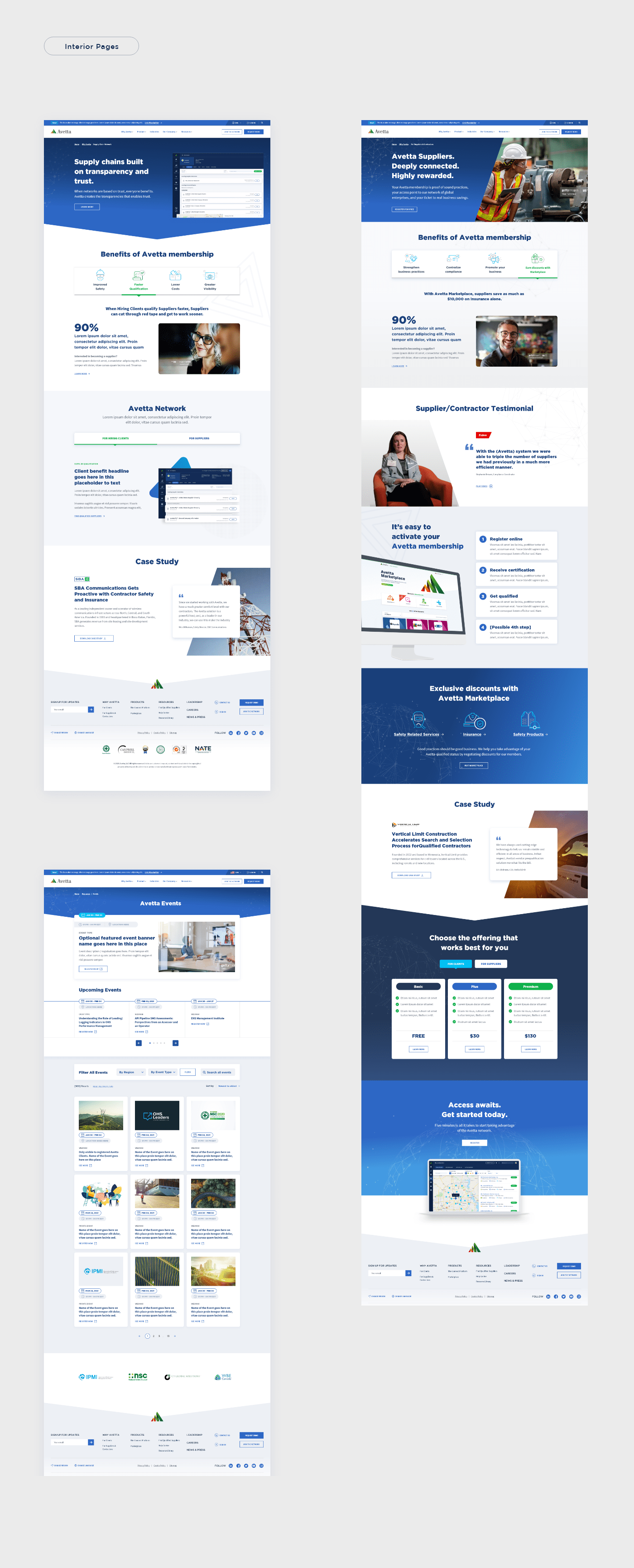
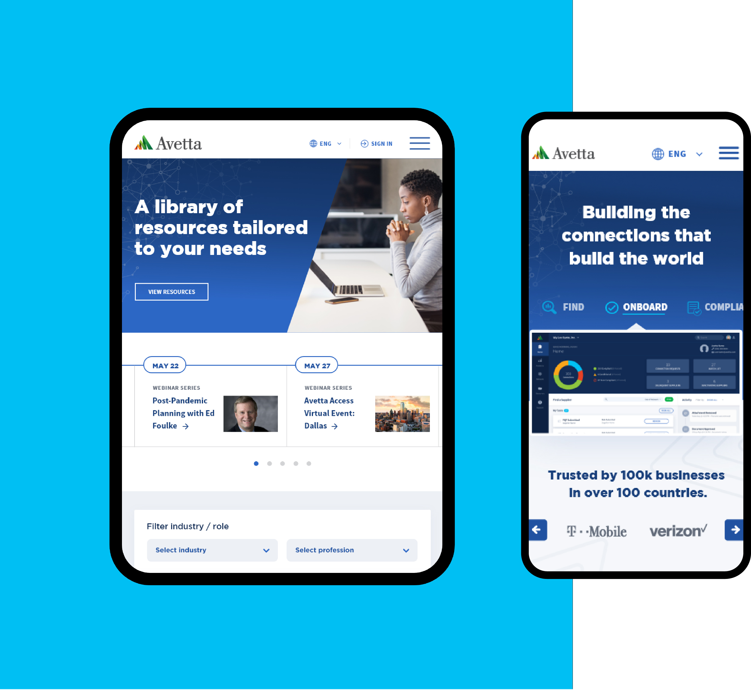
Rather than presenting large volumes of information at once, the interface introduces complexity gradually — through structured layouts, progressive disclosure and consistent hierarchy. Large headlines establish context before supporting content adds depth, and interactive demonstrations replace lengthy descriptions wherever possible.
Every page answers one question before introducing the next, so the experience feels significantly simpler than the technology powering it.
languages supported across deployments
modular visual system behind hundreds of pages
pages generated from reusable components
Building a Digital Ecosystem
Designing pages wasn't enough — Avetta needed a framework.
The website supports product marketing, customer education, industry resources, thought leadership, events, customer stories, interactive product tours, videos, multilingual experiences and technical documentation — each serving a different purpose yet feeling unmistakably connected.
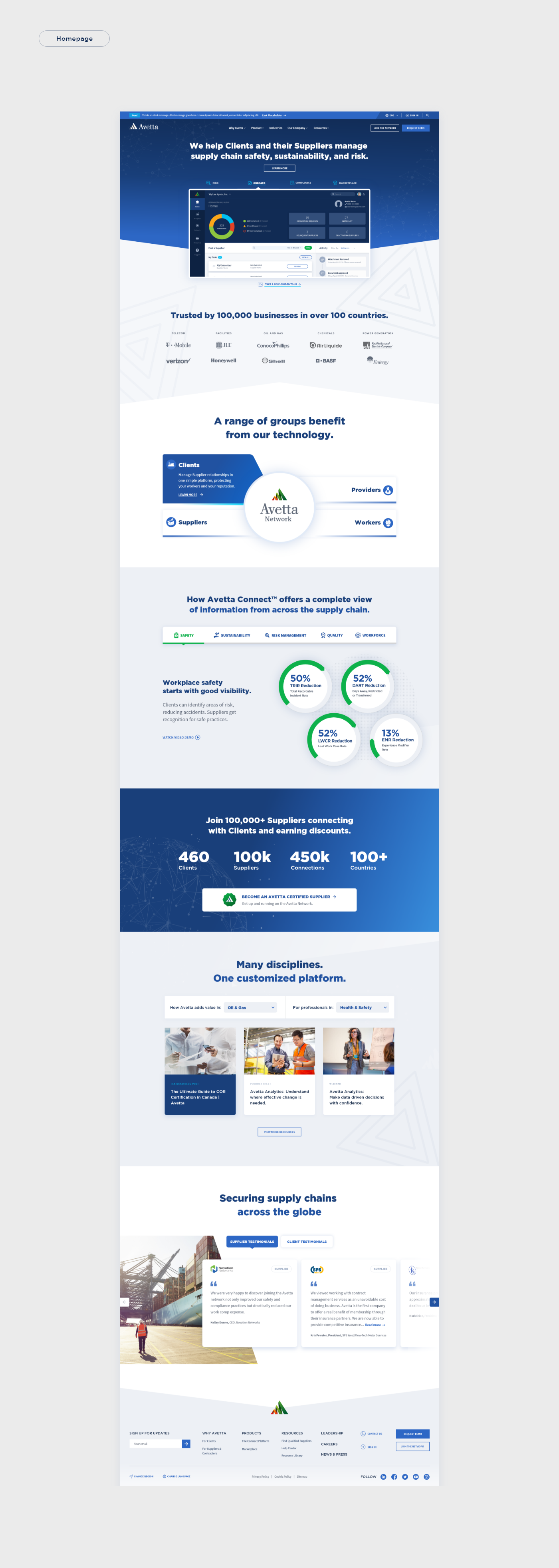
I helped develop a modular visual system of reusable components, flexible layouts, consistent spacing and scalable typography, so teams could expand the platform without sacrificing consistency. Rather than creating dozens of unique pages, we created a system capable of generating hundreds.
Showing the Product
Demonstrate the product — don't just describe it.
Interactive product tours, animated interface previews, explainer videos and infographics translate complex enterprise workflows into something immediately understandable. Instead of relying on marketing copy alone, users could experience the platform visually — a shift from explanation to demonstration that made sophisticated software feel considerably more approachable.
“The role of design isn't to simplify products. It's to simplify understanding.”Miguel Mendonça — on designing Avetta
The Outcome
A cohesive enterprise ecosystem built to grow.
The redesign established a far more cohesive digital experience capable of supporting Avetta's growing platform and expanding product portfolio. Complex information became easier to navigate and product value easier to communicate — and the project introduced a scalable visual foundation capable of supporting future growth without compromising consistency.
What I delivered
- 01 Art direction & visual system
- 02 UX/UI mockups, multi-lingual
- 03 Modular, reusable components
- 04 Interactive demos & product videos
- 05 Infographics & multimedia content
- 06 Responsive layouts