Intranet · UX/UI · Design System
FedEx
Transforming internal communication into a modern, scalable employee digital workplace.
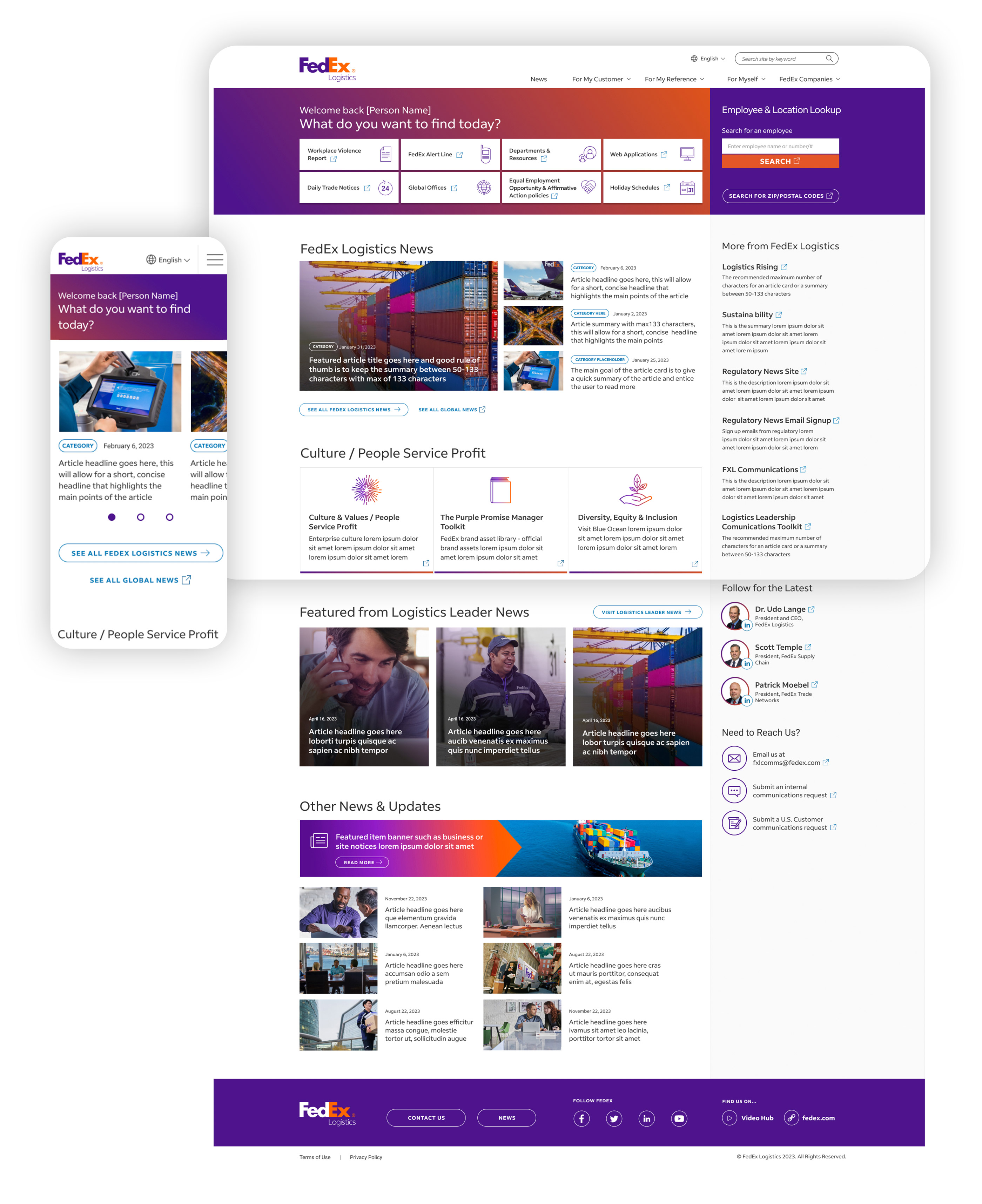
A bespoke digital workplace replacing an aging SharePoint intranet — built around the way FedEx Logistics employees actually communicate, collaborate and share knowledge.
Overview
Great customer experiences are built from great employee experiences.
FedEx Logistics set a clear objective: replace an aging SharePoint intranet with a bespoke digital workplace employees would actually enjoy using. The existing platform had become difficult to navigate and maintain, and increasingly unable to support the way teams communicated and shared knowledge across the organization.
The goal wasn't simply to redesign an internal website. It was to create the central destination for communication, collaboration and company culture.
The Challenge
An architectural problem, not just a visual one.
Unlike public websites, an intranet serves an incredibly diverse audience — employees arrive to read company news, access HR resources, locate documentation, find colleagues, discover policies, or publish their own content.
The old SharePoint implementation struggled to support these workflows. Content had grown organically, navigation had fragmented, and templates offered little flexibility. The new platform needed to simplify information without oversimplifying the business.
Designing Content-First
Structure before aesthetics.
Working alongside the FedEx Logistics team, we redefined the sitemap and reorganized content around the way employees naturally think and search — rather than how departments were internally structured. This created a more intuitive navigation model and reduced the clicks required to reach frequently used resources.
One principle guided every decision: content should never fight the interface — the interface should quietly support it.

digital workplace replacing SharePoint
content types from one component toolkit
responsive, from desktop to warehouse floor
A Flexible Design System
I designed a toolkit, not a set of pages.
Internal communications constantly evolve, so editors needed to publish everything from quick announcements to detailed documentation without a new template for every scenario. I built a modular component system of reusable blocks — articles, news, announcements, feature pages, banners, galleries and callouts — that combine using consistent design principles while staying visually harmonious.
This gave content creators far more freedom while keeping the overall experience coherent, regardless of who published.
Responsive by Default
Employees don't read company updates only from a desk.
Whether checking news from a warehouse floor, reviewing documentation on a tablet, or accessing HR resources on mobile, the experience had to perform across every screen. Every layout was designed responsively from the beginning — navigation, spacing, typography and hierarchy tuned for readability on any device.

“Employee experience deserves the same design thinking as customer experience.”Miguel Mendonça — on the FedEx Logistics intranet
The Outcome
A modern digital workplace, built to last.
By restructuring the information architecture, introducing a reusable component system, and designing responsive templates for a wide variety of content, the platform replaced an aging, inflexible SharePoint experience with one that's significantly easier to navigate, easier to maintain and more adaptable to the evolving needs of the business.
What I delivered
- 01 UX strategy & information architecture
- 02 User journey mapping & wireframing
- 03 UI & responsive design
- 04 Modular component library
- 05 Interaction & visual design
- 06 Developer specifications