Brand Identity · Visual Guidelines
Domitur
A complete visual identity for a Portuguese travel company with three decades of premium experiences.
A complete visual identity system for Domitur Travel — a Portuguese destination management company with three decades of experience creating premium travel across mainland Portugal, Madeira and the Azores.
Overview
Modernize a trusted travel brand without losing its heritage.
The objective was to develop a comprehensive visual identity that positions Domitur as a premium travel partner while preserving the equity built over thirty years. The result is a complete brand guidelines document that establishes a consistent visual language across every customer touchpoint — from digital experiences and printed collateral to outdoor advertising and social media.

Visual Identity
Timeless elegance with a contemporary editorial aesthetic.
The visual language draws on premium hospitality and luxury travel brands. A refined palette built around deep navy, warm neutrals, crisp whites and vibrant accents creates a sophisticated yet welcoming identity.
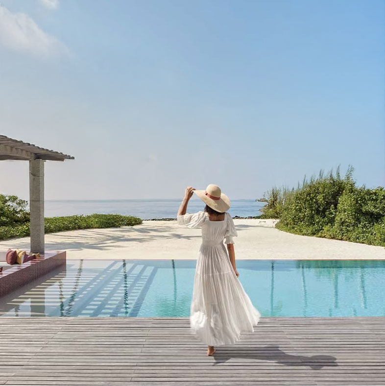
Carefully selected typography reinforces clarity and premium positioning, while photography emphasises authentic travel experiences, natural landscapes and understated luxury.

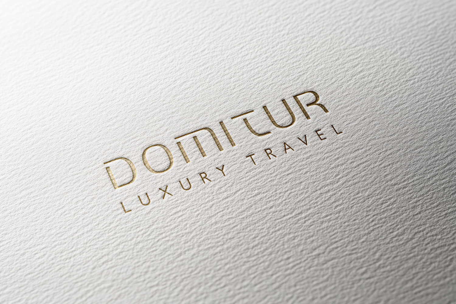
Sub-Brand Architecture
One master brand, four distinct sub-brands.
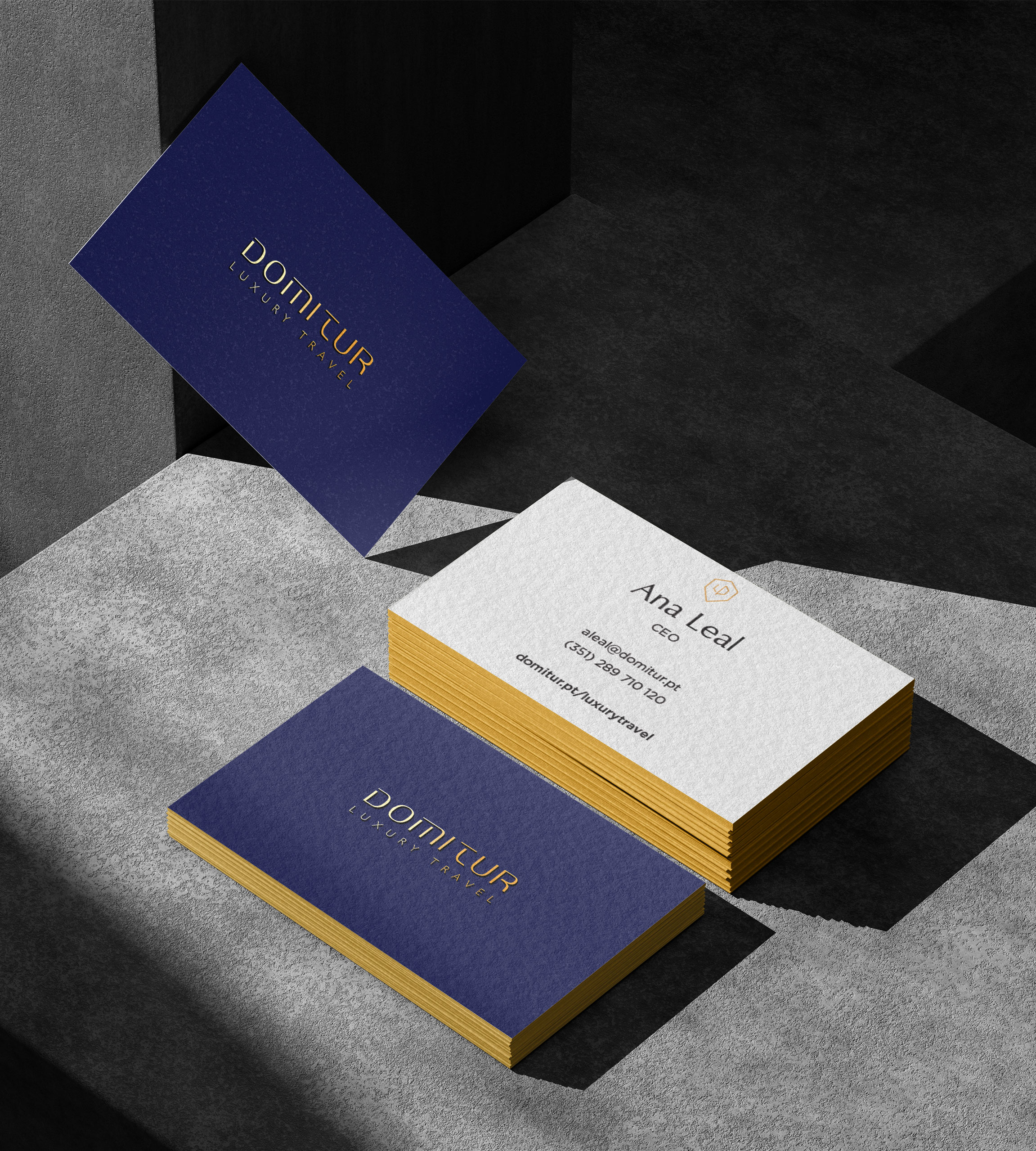
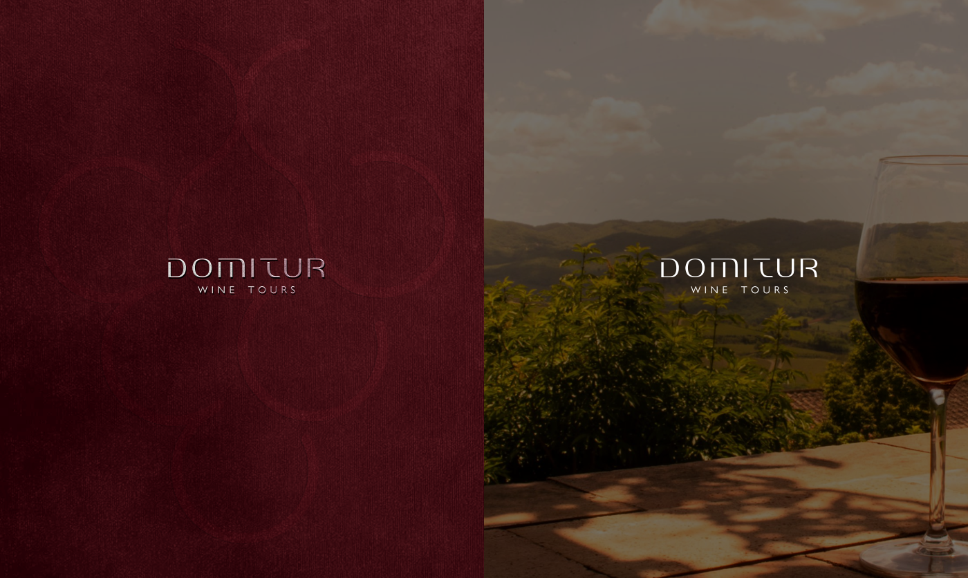
A scalable identity system supports multiple service offerings while maintaining a strong connection to the master brand — with dedicated identities for Luxury Travel, Nature Tours, Wine Tours and Golf. Each sub-brand carries its own palette and personality while remaining unmistakably part of the Domitur ecosystem.



years of brand heritage preserved
sub-brand identities in one system
page brand guidelines document

Brand Applications
An identity that performs everywhere it appears.
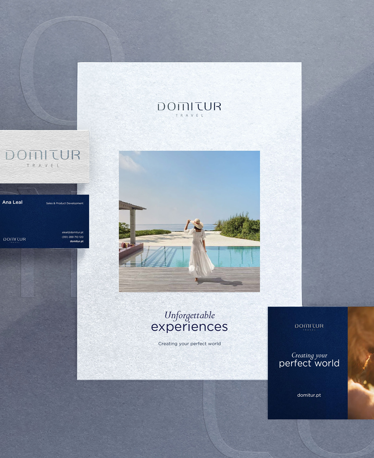
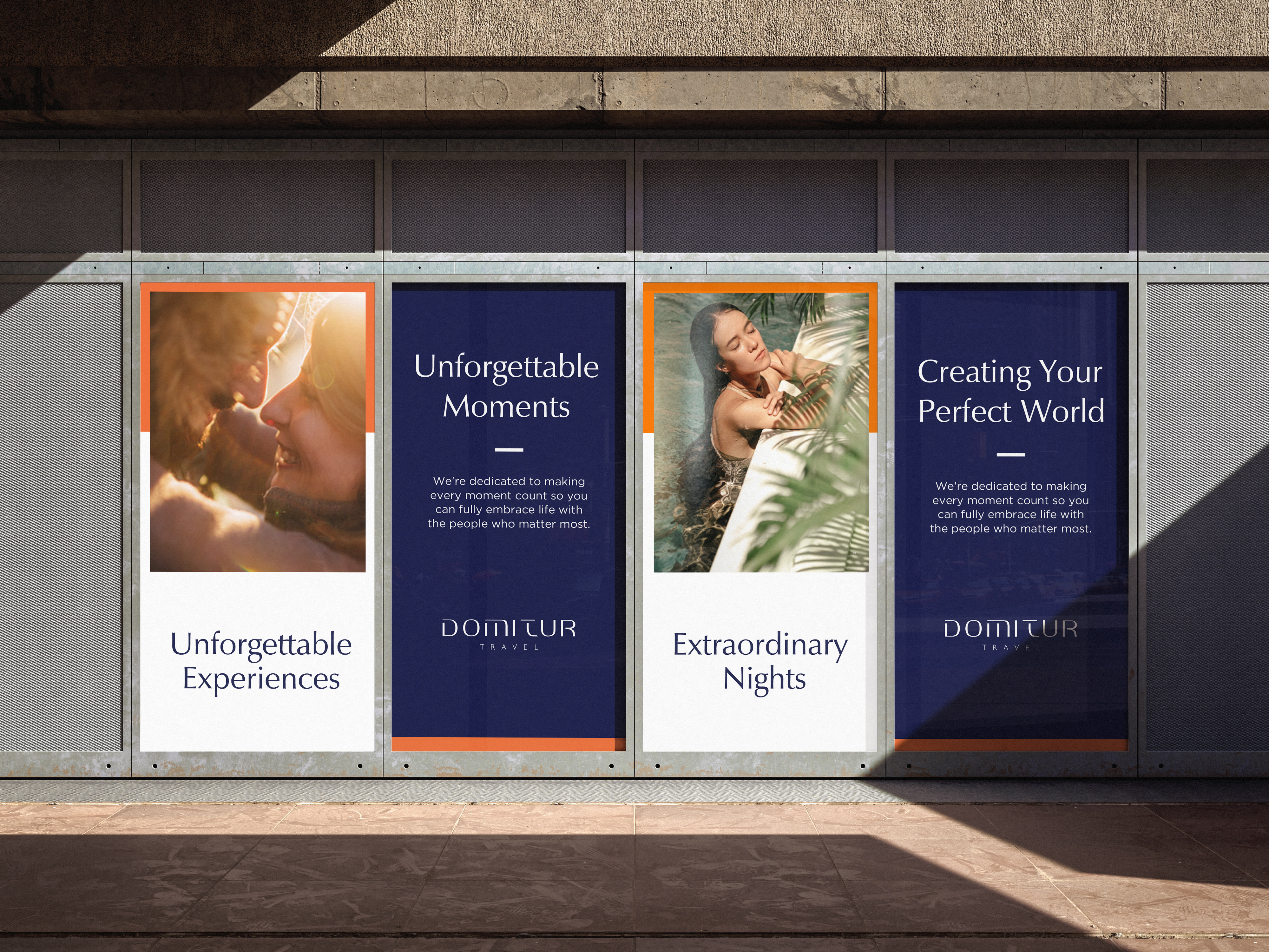
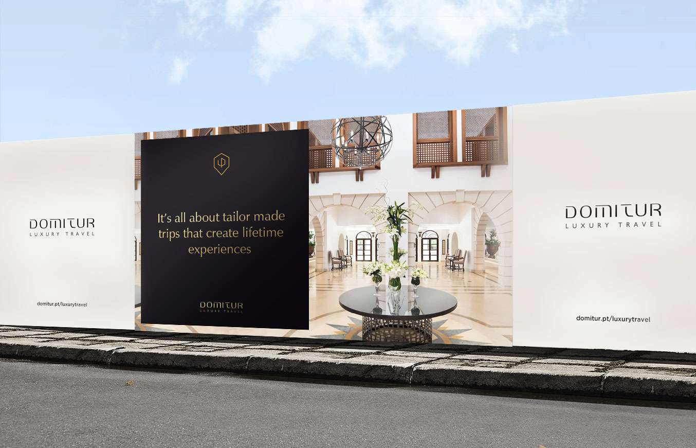
The guidelines demonstrate how the identity extends consistently across business stationery, printed brochures, outdoor signage, promotional materials and social media. Real-world mockups show how the brand performs across multiple environments, ensuring consistency, flexibility and long-term scalability.
“Modernize the brand, but keep the heritage customers already trust.”Miguel Mendonça — on designing Domitur
The Outcome
A cohesive brand built for long-term growth.
The final deliverable is a comprehensive 27-page brand guidelines document that serves as a practical reference for designers, marketing teams and partners. By defining clear rules for logo usage, typography, colour, imagery and applications, the system establishes a cohesive brand experience capable of supporting Domitur's continued growth across both domestic and international markets.
What I delivered
- 01 Brand strategy & positioning
- 02 Logo system & usage guidelines
- 03 Colour palette & typography
- 04 Four sub-brand identities
- 05 Stationery, signage & collateral
- 06 27-page brand guidelines