Brand Identity · Logo · Guidelines
Topeça
Modernizing an established construction brand without losing its recognition.
A brand identity refresh for Topeça, an established Portuguese construction company — modernizing the visual identity while preserving the recognition customers already trust.

Overview
Some brands don't need reinvention — they need clarity.
Topeça had built years of recognition in the Portuguese construction market, but its identity relied on dated gradients, 3D treatments and inconsistent applications that were hard to reproduce across print, digital, signage and branded materials.
The objective wasn't to create a new company. It was to reveal the company that already existed beneath an outdated visual layer.
The Challenge
Construction companies compete on trust long before price.
When clients invest in large-scale painting and finishing services, they expect professionalism at every interaction — on-site and across every document, proposal, vehicle, uniform and piece of marketing.
Multiple logo versions coexisted and consistency was lacking. The challenge was to modernize the identity while ensuring existing customers would still instantly recognize the brand they already trusted.

Design Strategy
Refinement, not reinvention.
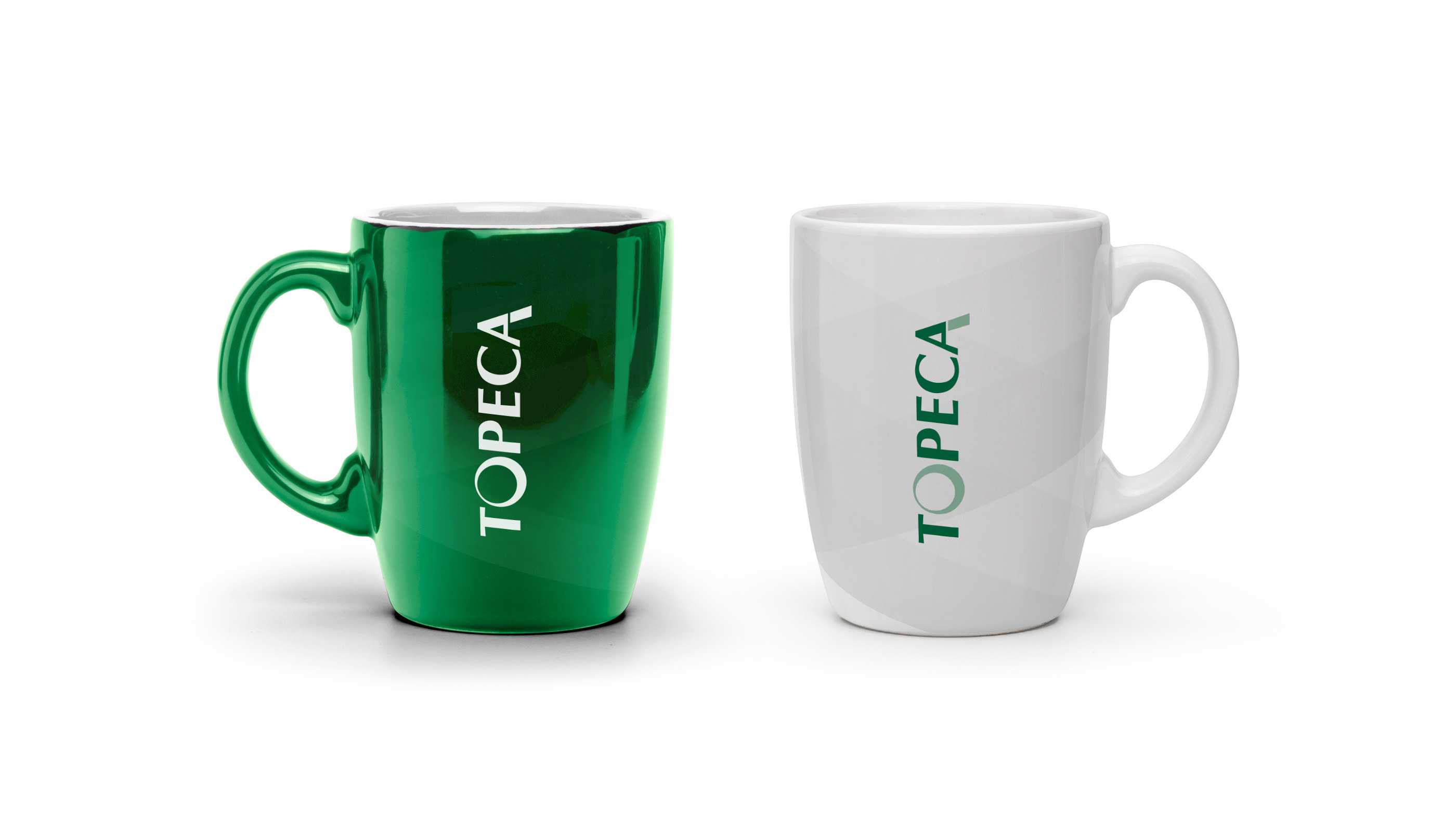
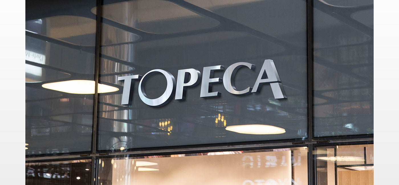
Rather than creating an entirely new symbol, I focused on refinement — removing unnecessary visual effects and simplifying the logo into a cleaner, more geometric composition that feels contemporary without abandoning familiarity. The recognizable letterforms stay intact, preserving years of brand recognition while dramatically improving versatility.
Every decision was guided by three principles: recognition, simplicity and consistency.
guiding principles — recognition, simplicity, consistency
unified visual language across applications
recognition preserved through the refresh
A Flexible Brand System
A successful identity isn't measured by the logo alone.
It succeeds when every application feels like part of the same family. I developed a visual language built around typography, generous white space, bold green accents and subtle circular graphic elements derived from the logo itself.
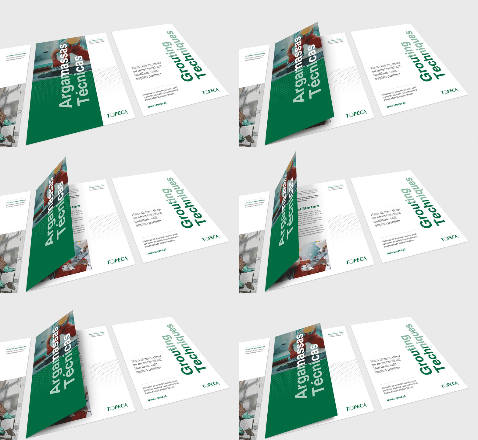
These recurring shapes became a recognizable device across catalogs, business cards, stationery, promotional materials and uniforms — establishing rhythm and reinforcing recognition rather than simply decorating layouts.


Beyond the Logo
Every customer-facing asset became an opportunity to reinforce the brand.
Business cards adopted a cleaner hierarchy and stronger typography. Stationery embraced generous negative space and subtle graphic detail. Product catalogs took a more structured editorial approach, and even branded apparel followed the same principles — turning employees themselves into ambassadors of the refreshed identity.
“Modernize the identity, but keep the recognition customers already trust.”Miguel Mendonça — on designing Topeça
The Outcome
A confident, recognizable brand built for long-term growth.
The redesign transformed Topeça from a traditional construction company with an aging identity into a brand that communicates professionalism, reliability and contemporary expertise. By simplifying the logo and extending one visual language across every touchpoint, the company gained a cohesive identity its employees can proudly represent and its customers immediately trust.
What I delivered
- 01 Brand strategy & logo redesign
- 02 Visual identity system
- 03 Colour palette & typography
- 04 Brand guidelines
- 05 Stationery & catalog design
- 06 Marketing materials & apparel
